Ontario’s New Logo |
|
 Things sure are picking up pace in terms of changing images here. After the proposed new Toronto subway trains, now the Ontario government has radically changed its logo – The Trillium, after the official flower – to an uber-modern looking one, turning it upside down.
![]() Actually, now it looks more like a teenage social networking website’s icon than a province’s logo. But it’s only my opinion!
Actually, now it looks more like a teenage social networking website’s icon than a province’s logo. But it’s only my opinion!
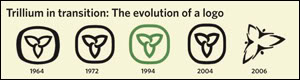
On the right, above, is the evolution of this logo from the way it was originated in 1964, and minor changes over the years. Notice how drastic a change it is from the previous modifications.
Some are criticizing that since this change has been made by the province’s Liberal government, it “eerily” resembles the liberal party’s own insignia (on the left, main liberal, and right Ontario Liberal). Well, I’m not too sure about that, really. Sure it has the similar ‘zing’ to it, but the new Ontario logo is far, far more, er, jazzy than this one. The ‘swish’ on the liberal logo is quite subdued, imho.
 Update: As I have now realized, the Liberal Party of Ontario has a different logo, whose letter i’s dot contains the new Trillium’s inspiration… I guess there are just too many liberal variations, for consistency, ie… oh, what do I know… I’m still learning here…
Update 2: Paying respect to the brilliant observation of kind reader defex , I hereby rename the The Trillium to The Jacuzzi. :)
|
|
First Published:
June 23rd, 2006
|